Showing posts with label Walkthroughs. Show all posts

October 23, 2009

Nate Berkus: How to Make a Small Place Feel Big!


I finally had the chance to catch up on my October issue of Glamour yesterday during my flight out of town. I loved this article in which celeb designer, Nate Berkus, transforms his sister Marni's one-bedroom New York City apartment into a chic pad!

I love the soothing palette of grey, beige, and cream spiced up with a few colorful throw pillows for added interest. 
With a small desk area, decorating vertically with a corkboard to make good use of your limited space is a must!

With studio style living, creating a separation of living spaces is so important. I love the way this high back sofa pushed up against the bed achieves the illusion of division. 

I adore is this little Moroccan side table (where can I get one?)! It's the perfect way to personalize the living room while adding function. 

Why not paint one piece of furniture in an unexpected, energizing color? What a fun DIY weekend project this would be!

In open plan living spaces like a studio, everything is on display! So invest in making your bed a beautiful centerpiece you want people to see!

How clever is this? Organizing your clutches in magazine files! I will definitely be borrowing this idea! Nate never fails to turn beauty and function into anything he touches!

Wishing you all a wonderful weekend! Happy Friday! xoxo Crystal

September 22, 2009

Vicente Wolf's Worldy Loft, Garmet District NYC


I first saw this home featured on a HGTV Top 10 Living Rooms Count Down - it was love at first site! I kicked myself at the time because I didn't catch the name of the designer and couldn't go google him/her to find the images. 
But one day while visiting Alek's blog, I read a post she did on Vicente Wolf. And voila' - there was the home I had seen and fallen in love with months ago! Don't you love it when that happens? Thanks Alek :)
It turns out that the home is actually Vicente's NYC loft. It's filled with gorgeous artifacts he's collected over the years from his world travels. And all that photography you see? It's his work too - he's a self taught-designer and self-taught photographer (my kind of guy!). His use of wall shelves and chairs as a means of displaying his work is genius. It gives the photography that showcased art gallery feel and provides an easy way to rotate work in and out with time. 

I don't think it'll come as a surprise to all of you to know that my heart fills up with joy at the sight of all this white! As I've mentioned here before, in a world where there is so much noise and chaos around us, it's nice to come home to a color palette of white to evoke feelings of cleanliness, purity, and serenity. Vicente adds just the right amounts of warmth to keep the space inviting through the warm wood elements and pops of taupe, beige, and live plants. 
And of course, how could you not love the diagonal placement of this bed?! (It reminds me a lot of this one) Isn't it nice to get away from all the right angles sometimes? It's like a breathe of fresh air!

So, what do you think? Are you with me on this one? Isn't it a beautiful space? I think it's in the number 1 spot for my own apartment re-do inspiration. 

Psst, he also has a blog!

August 17, 2009

Andrew Flesher's Sensational (White) Home!

If you've been a Plush reader for awhile, you've probably caught on that I have a thing for white spaces. They get me every time! That's why when I stumbled upon an interview and walkthrough of interior designer, Andrew Flesher's home on LoftLife, my heart jumped up and skipped a beat in excitement!

I love how the white bookcase blends into the white walls surrounding it, but still creates a strong sense of separation from one space to the next. With open floor plans, this is a fabulous way to create division on spaces and rooms that otherwise don't exist. 
Maybe because I'm on the hunt for a new one myself, but this dark wood coffee table jumps out at me and grabs my attention! I  love it's large size - a criterion for my new one - to accommodate lots of plates, wine glasses, and appetizers when entertaining. The carved sides are also a beautiful detail that gives it a sense of timelessness and luxury. 
In a space that is so airy and white (the walls, the ceiling, the floors), Andrew's use of dark accents, like the coffee table, console, and furniture trim, really helps ground the space and truly define in. The chocolate brown area rug is such a perfect example of the power of anchoring in a room. 
A touch of traditional sensibility in a modern, industrial space is such an unexpected and pleasant surprise! It shows great depth and versatility on the part of the designer. I simply love it!
These tall back dining chairs (where can I find them?!) are wonderful! They carve out the perfect silhouette against the clean canvas of white. And the bertoia bar stools - that is a chair design I never get tired of seeing!

*images via LoftLife

August 11, 2009

Another Swedish Home to Fall in Love With

This place is just stunning in my eyes! The the soothing color palette of grey and blue mixed with warm elements like wood and brass, create the perfect balance of warm and cold, new and old, modern and rustic. And my heart swoons!

Perfection!! In September I'm moving into an apartment with a similar fireplace and I've already started scouring eBay and Etsy looking for two candelabras like these for the mantle! I'll take the chandelier too, please :) The sparse accessorizing here is what does it for me. It highlights the few special pieces present and they command so much more attention because of it!


This chandelier has single handedly made me consider using brass and gold finishings for the first time in my new place! It's hard to step away from my comfort zone of silver and nickel, but I'm up for challenging myself to try something new!


The modern, clean lines with pockets of warmth and vintage finds is pretty much my aesthetic in a nutshell. Do you like it, too? How would you describe your aesthetic?

August 3, 2009

Converted Church: Beautiful Home

I've seen a church converted into a home once before but when I saw these images, I fell in love all over again. The wide open floor plan, the floor to ceiling windows, the flood of natural light, and the beautifully preserved character of the space are what my dreams are made of. Do you love it, too?


*images via Light Locations, discovered via La Belle Lumiere

July 22, 2009

Swoon Worthy Style: Dallas Chic!

Grace over at Design*Sponge posted this walkthrough the other day for her Sneak Peek series (my absolute favorite), and I fell in love...big time! The incredible home belongs to Samantha Reitmayer, a graphic designer in Dallas, whose eye for design is undeniable. It reflects such originality and a strong sense of personal style!
This bedroom is full of things I adore! The two massive mirrors flanking the bed, those whimsical horns above it, the tree stump night stands, the cross pillow in the middle. But, what really stands out to me is that ceiling! I love the wood paneling in soothing blue. It creates that warm, rustic feel I strive for!

From the chic shabby pillow on the left, to the intricate armoire detailing on the left, this home is beautiful all over!
What I love about Samantha's aesthetic so much is the feminine touches and twists, like in her dressing room above. Her conscious effort to make it romantic and girly really shines through. And what girl wouldn't want this home as her personal bachelorette pad and retreat!

This armoire truly is a beautiful piece of art! And functional, too as I'm sure it houses loads of storage! I love the antique feel of it paired with that ultra modern and chic leather bench in front!


This dining area is perfection in my eyes! The rustic wood table and bench + the lucite chair and fur covering + the massive lamps casting a pretty glow = all the things I love!


Did you notice those cool closet door handles? When they say, "Design is in the details," I think this is exactly what they mean! It's these types of touches that truly transport a space from blah to fab!

Thank you to Samantha for inviting us into her truly gorgeous home and to Grace for sharing it with the world! Oh and don't forget to head over to Samantha's lovely blog, style/SWOON! It's full of more gorgeousness!

*the beautiful photography is by Manny Rodriguez via Design*Sponge

July 16, 2009

Dreaming of Summers in Siena

It has always been my dream to buy an old, abandoned Tuscan villa and resuscitate it back to its original magic and glory. I'd enjoy every moment of discovering the home's quirks and history, shopping for antique pieces to suit the space, and the fulfillment of slowing watching it come back to life! That is exactly what these home owners did and why I am drooling with envy over their gorgeous estate just outside of Siena in Italy.
I love this palette of blue, red, brown, black and white. Something about it is both contemporary and old equestrian - perfect for the famous Palio horse races that in Siena each year.
I'd love to be able to put my makeup on in the mornings at this boudoir and watch the landscape outside the window to my left. What a soothing place to start the morning! And then at night, wind down with a bath in this 19th century tub under the low glow of this chandelier of the same period.
I think I could get a little work done at this desk while being inspired and consumed by the gorgeous mural of pastoral scenes in Tuscany.

I adore the flood of Tuscan sun drenching this room! The soothing palette of pastel blue, beige, and red don't overpower the beautiful details of this room - the arched window, the terracotta tiled floors, the high ceilings - but let the space speak for itself!

And then at the end of the day, when all is said and done, I'd come out to this veranda and watch the sunset on this twenties style sofa with a glass of vino in hand!

July 2, 2009

Pucci's Palatial Paradise

Here's a peek inside fashion royal, Laudomia Pucci's country estate just outside the foothills of Florence. It's absolutely breathtaking and filled with precious family heirlooms (like a coat of arms!). I love the whole Mediterranean royalty vibe and use of strong graphics and colors...just like the fashion house' signature look.
How's this for an entrance hall!? Isn't that 16th century fireplace to the left and the solitary floor pillow placed in front wonderful? And I would kill for arches, columns, and windows like that. The sunlight would be enough to make me never want to leave!
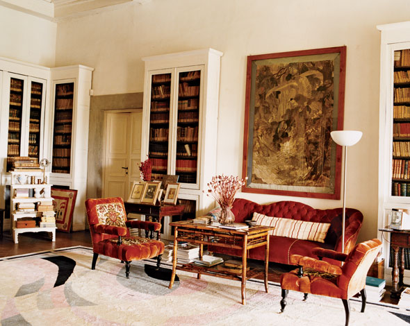
I would also kill for this vintage Pucci rug in the main living room. The hint of pink is the perfect complement to the dark red 19th century furniture, which I might add is from Emilio Pucci's grandmother's personal collection....a descendant of Catherine the Great!
These are the kinds of things that catch my eye and evoke a sense of deep admiration for the designer...the tilt of the desk placement is just perfect! It's one of those things that could look off at first glance but the more you stare, you can't deny that it is so right on! And aren't those original Emilio Pucci painting stunning? I've fallen in love with this home :)
*images via W magazine
Related Posts Widget for Blogs by LinkWithin